BOXBROWNIE.COM, A BOLD NEW LOOK AND BRAND
BoxBrownie.com has spent three years dominating the digital space as the online hub for property professionals who want to turbo-charge their property marketing. In this time, the BoxBrownie.com product offerings and services have evolved as the company innovates to cater for the needs of property professionals globally. The time has come to move toward a new brand more reflective of the nature of who BoxBrownie.com is, and what the brand will be in the future.
The brief for the new logo is to be easily identifiable, and instantly recognizable as BoxBrownie.com. Additionally, we wanted to instill our relaxed cultural values, and the contagious excitement of the clients we meet across the globe.
New logo use cases
To start we made a list of every scenario where the new logo could conceivably be used:
Website – header, footer, before and after sliders, favicon
- Social platforms including Facebook, Instagram, Twitter.
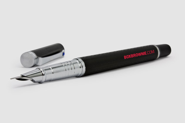
- Print materials and electronic equivalents including brochures, letterheads, flyers.
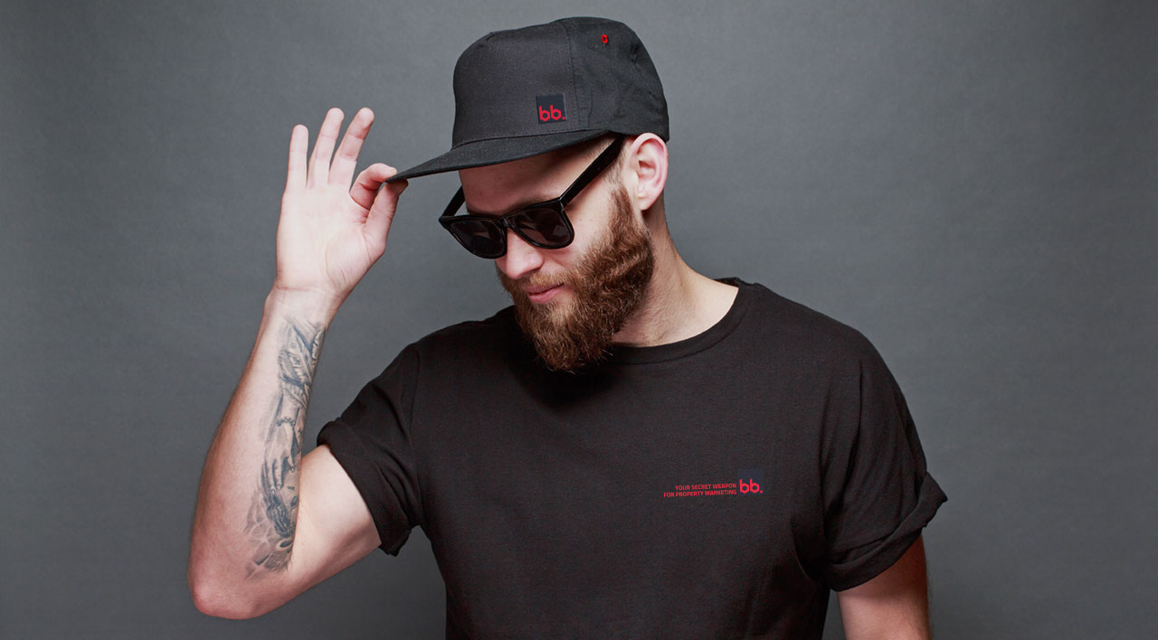
- Apparel including polos, tees, hoodies, caps, jackets. All types of apparel must be catered for, including styles such as street wear and corporate wear.
- Trade show gear – banners, backdrops, table cloths. It must be eye-catching and stand out to busy conference attendees.
- Watermark for videos – including educational videos that aren’t directly featuring our product offerings.
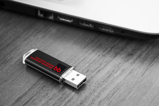
- Promotional materials – water bottles, USB sticks, stationery
- Banner advertising – including online and print
- Email newsletters
- Email signatures
- Mobile apps
Presenting the new and improved BoxBrownie.com
The new identity capitalizes on one of the major points of discovery during three years in the marketplace. BoxBrownie.com is often referred to as BB.

Before
After
BB is bold, versatile and most importantly memorable
All services offered by BoxBrownie.com are digital, to tie this into the logo mark, the BB is encased in a square referencing a pixel, the backbone of every service offered by BoxBrownie.com. The x height of each B is reminiscent of the lens blades found in a camera to create a mark that is truly unique.
Red, the color of desire
To complement the minimalistic logo mark, red was introduced to solidify the visual appeal of the new brand. Using red as an accent color for a tech brand showcases innovative thinking and creates a must have feeling. The red is complemented with a tonal black that aids in the visual balance. The simplicity of the new color palette and logo mark is a perfect complement to the most important visual element of the business, before and after examples of the variety of services available at BoxBrownie.com.
“The shift to a solid logo mark from the old logo injects a solid understanding of the key values of the business while making the logo extremely easy to recognize in the market.”
A brand evolved!