MAXIMIZING PROPERTY APPEAL WITH COLOR PSYCHOLOGY
Colors have a profound impact on human emotions and behavior. For example, blue wavelengths of light can stop our bodies from releasing melatonin, therefore stimulating us to stay awake, and red is thought to increase hunger.
In marketing and branding, colors are a powerful tool for evoking specific feelings and associations. In the context of real estate, they can influence everything from a buyer or renter’s first impression of a property to their willingness to make an offer.
In this blog, we’ll break down the strategic role of color psychology in real estate marketing room by room, so that you can leverage it effectively to present a property to its fullest potential.
Living Spaces
As one of the most used spaces in a home, the living room is a space for relaxing and entertaining. The colors in the living room should be calming, and soft neutrals like beige or taupe are a safe bet to entice a wide range of buyers. To add a touch of coziness, bring in burnt orange or muted green accents through artwork, cushions, or throws – don’t go overboard with the warm colors though, as it can make the room feel smaller.
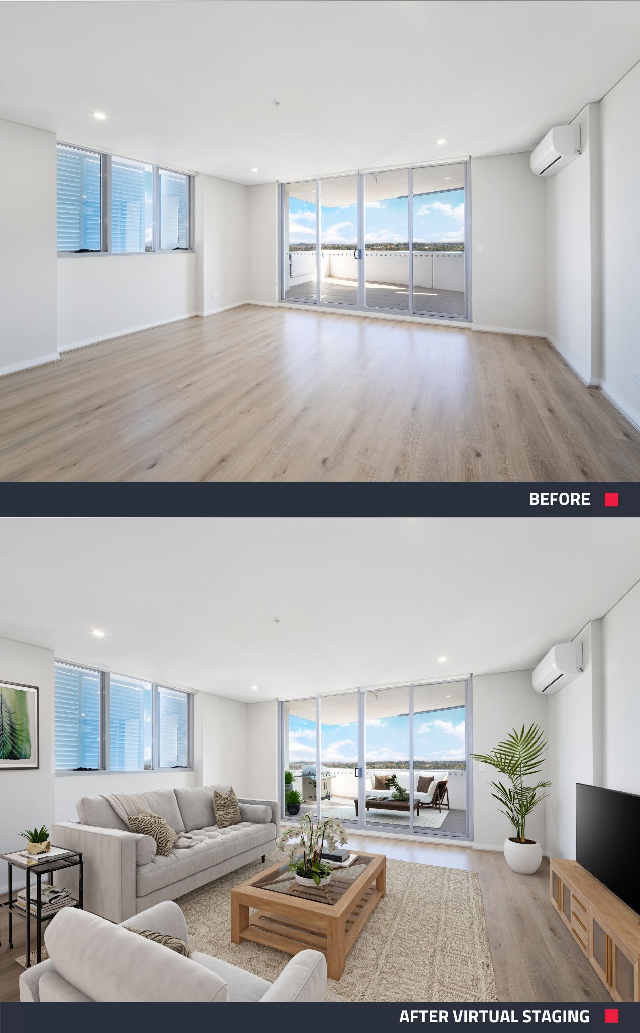 |
| Set your listing up for success with soft, neutral colors in the living room. Do you have a vacant property? No problem! Our expert editors will virtually stage your photos and follow a requested color scheme to set the right tone with potential buyers. |
Kitchens
Often referred to as the heart of the home, the kitchen should radiate cleanliness and welcoming energy to potential buyers and renters. Opt for blue and yellow shades to accent the space with a positive, clean feel. Orange and red tones can stimulate appetite, while green or beige tones can add a natural, organic vibe to a kitchen.
Bedrooms
The bedroom’s main function is to be a space for relaxation. Cool, muted tones are ideal for this space and assist in relieving stress and anxiety. Soft shades of blue, lilac, and dusky pink are perfect when adding artwork, cushions, or decor to a bedroom.
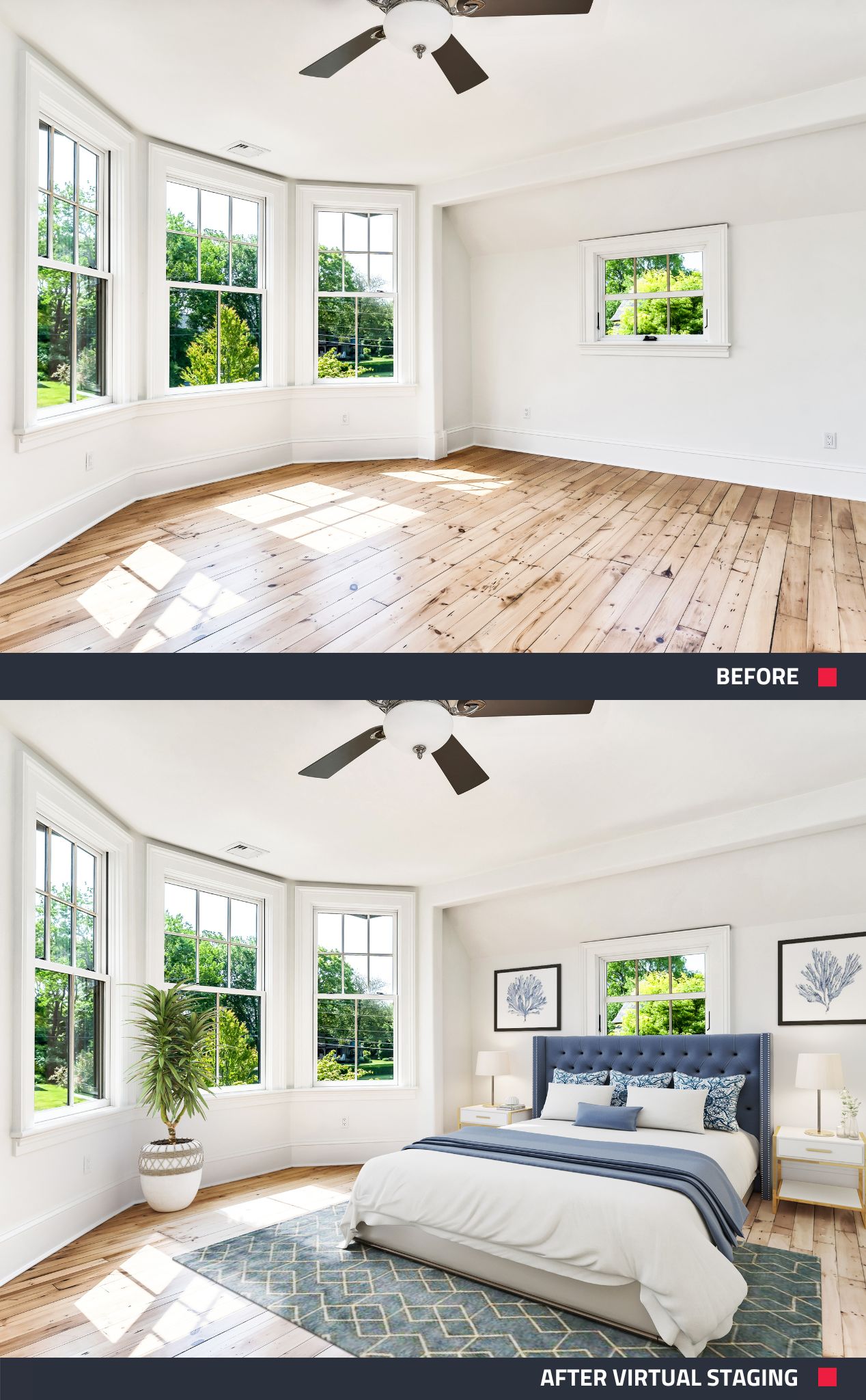 |
| Keep things light, airy, and serene with hints of blue in the bedrooms. |
Bathrooms
Like kitchens, bathrooms should radiate cleanliness, as well as relaxation. Recommended colors include light blue or green to create a clean and fresh vibe. Keeping the space mostly white signifies cleanliness and keeps things timeless and spa-like.
Offices
Whether it’s a home office or a commercial office, it’s essential for the space to feel calm and productive. The color green can assist with long-term concentration, making it a good choice for an office space. Soft, muted tones like sand and beige work well in offices too. Avoid the color red, as it stimulates and excites the brain, and can be a distraction.
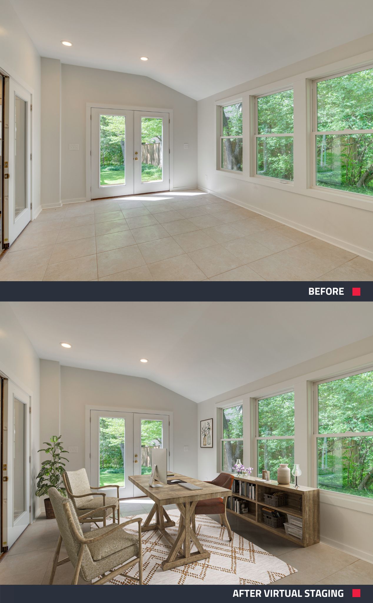 |
| Office decor or Virtual Staging should be based around a soft, muted color palette to stimulate a sense of calm and productivity in the brain. |
Dining Rooms
The dining room is another shared space and can benefit from staging that gives it a cozy, warm atmosphere. Warm, deep colors like burgundy are thought to stimulate conversation and can prompt a potential buyer or renter to imagine hosting holiday parties and dinner guests. Dark blues and greens can add a touch of elegance to a dining room as well.
Children’s Rooms
When staging a children’s room, the aim is to evoke a playful, cheery atmosphere that will entice potential buyers with growing families. Soft pastel colors like mint green, pale yellow, or baby blue are top choices for creating a calming, yet happy vibe.
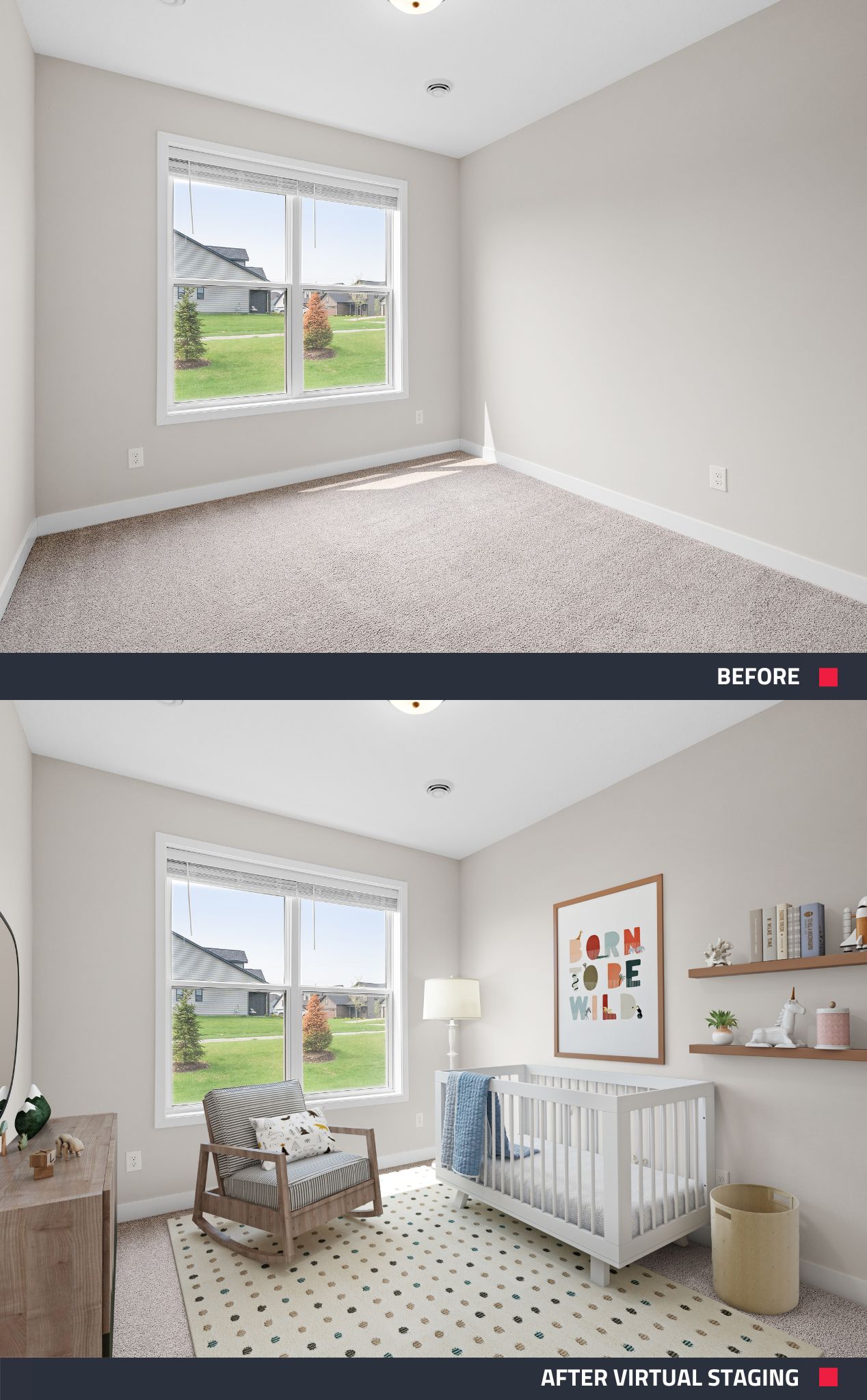 |
| When decorating or virtually staging a child’s bedroom, evoke a calm, happy vibe with pops of pastel colors. |
Maximizing Property Appeal with Color Psychology
From calming neutrals in living spaces to stimulating hues in kitchens and dining rooms, each room in a property can be tailored to evoke specific feelings and associations.
By understanding the psychological effects of colors, you can effectively showcase a property's full potential and create spaces that resonate with individuals on a subconscious level, ultimately enhancing its desirability and success in the market.
If you’re looking to either kickstart or revamp your real estate marketing with timesaving and cost-effective tools, sign up to BoxBrownie.com. You’ll receive 3 Image Enhancement edits, 1 Day to Dusk edit, and 10 AI-written listing descriptions, all for free! No credit card is required.
RELATED ARTICLES
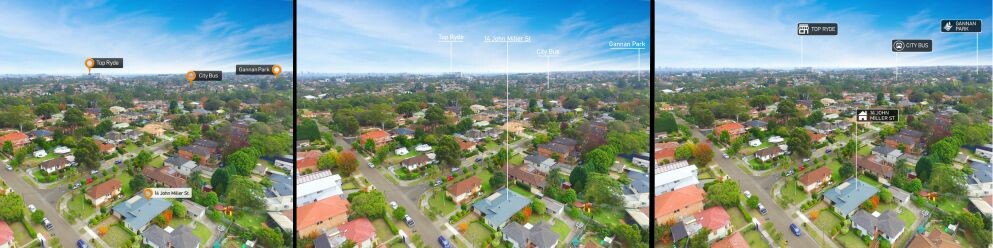
Looking for a fresh way to make your property stand out? Our revamped Aerial Drop Pin edits are here! With sleek new pin designs and customizable options to match your branding, you can create stunning, on-brand visuals that grab attention.
READ MORE
Our latest upgrade brings updates and messages directly to your dashboard, saving you time and simplifying your workflow. Ready to learn how it works? It’s all in this blog—click to find out more!
READ MORE
These four steps will help turn even your wildest real estate goals into achievable everyday realities. If you want to want to send your career into the stratosphere, this post will set the skyrocketing in motion.
READ MORE
Jon Sweeney transformed leasing across a 680-unit portfolio by upgrading listing photos. With sharper images and strategic virtual staging, even hard-to-rent units gained traction—cutting vacancy times and driving faster, more consistent leasing results.
READ MORE
We sat down with the broker and owner of NextHome Next Stepp, Wendy Anderson, to chat all things property marketing, and how she leverages our app and free AI Copywriting service into her team’s workday.
READ MORE
We just picked up the brand new iPhone 14 and one thing is abundantly clear – it is insane at taking high-quality photos! In this video, we shoot an apartment using Apple’s latest tech to showcase how much of a weapon the iPhone 14 is. Check it out now!
READ MORE